


Dirty Bird Fried Chicken
Identity Design / Branding / Viral Campaign
The story of Dirty Bird fried chicken began in 2014. Neil Young, the owner of Dirty Bird, has a real passion for food, and had just bought himself a food truck with the dream of touring the world; cooking up and serving the finest buttermilk fried chicken. But he needed a brand name and a logo. Young approached Mark James, an artist and graphic designer with a history of controversy in his back catalogue. They sat around a table eating burgers, drinking beer and talking through ideas. The name was finally agreed upon that evening in 2014. But this was just the beginning.
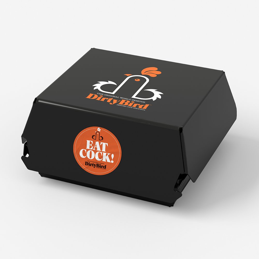
James was charged with looking after and creating the brand identity. He immediately started working through ideas, sketching and researching. Then one afternoon, in a flash of inspiration, James drew a simple sketch on a Post-It note, linking the lowercase initials D and B. By adding a beak, an eye, wings and a rooster’s comb to the top, the infamous logo was created, and Dirty Bird was born.
During Young’s first outing in the newly converted Dirty Bird truck at a food festival in South Wales, the logo was unveiled. As the customers queued for the delicious freshly fried chicken, one person in that queue saw something completely different in that logo. Abigail Griffiths was queuing up with her two young sons, “I looked at the logo and realised what it represents”, “It’s not the sort of thing that should be on display around children”. Griffiths didn’t see a rooster in the logo, she saw something a lot more phallic.
Griffiths then informed the local press about what she had seen. The local press published the story, and before Young and James knew it, it was national news. Every newspaper in the UK covered the story of this ‘filthy logo’ in print and online. After that the story went truly viral, it was featured around the world. From chat shows to lectures to major celebrities tweeting it, Dirty Bird was now a global phenomenon. People were questioning whether it was a “Cock or a Penis?”. Was the design intentional? Or was it accidental? It was featured in The Drum’s ‘Most Controversial Logos Of All Time’.
But there was a problem. As the brand was getting a lot of attention and now fast becoming world famous, the legal letters started to arrive challenging the name Dirty Bird. In 2021, Young finally got to own the trademark for Dirty Bird.
The logo and name have been copied by some shameless sorts in Thailand, Korea and Russia, to name just a few. Fake merchandise started appearing online, from t-shirts to watches. The logo was definitely a hit.
Nine years later, Dirty Bird is still going strong and still getting the attention it deserves. Young and his team have been serving the best fried chicken ever since.


Dirty Bird Fried Chicken Arouses Controversy With Logo Resembling Penis
Is This A Chicken Or A Penis? You Decide
A catering company called Dirty Bird Fried Chicken aroused some controversy with its suggestive logo. Some people who see the logo think it resembles a rooster. Others think it resembles a penis at the point of no return. Mark James, the logo’s designer insists it’s supposed to be a barnyard bird. “We were given the name Dirty Bird as the brief, and started working on ideas. We looked at the initials, DB. Then worked with the lower-case ‘db’ linking them to form the shape of a rooster. It’s a graphic representation of a rooster incorporating the initials. It depends on how you look at it,” he said according to the Mirror. “I’m not sure there have been any complaints. A few comments, but it’s in the eye of the beholder, as they say.”
David Moye - The Huffington Post
Fried Chicken Van Sparks Controversy With Its Quite Graphic Phallic Logo
The Dirty Bird chicken shop design is causing a bit of an uproar in the Welsh city.
What do you see when you look at the image above? Do you see a D and a B neatly placed together so as to form the initials of the Dirty Bird fried chickenbrand? Or is it perhaps just a drawing of a cockerel? Or, alternatively,maybe you see a pair of hairy testicles and a penis, which appears to be spraying orange sperm directly upwards in a thick, viscous stream? Whatever your personal interpretation, the somewhat phallic design is causinga bit of a stir in Cardiff city centre, where it adorns the van of fried chicken street food vendors Dirty Bird. Shocked customer Abigail Griffiths, 29, said: “I was queuing up with my two young sons when I looked at the logo and realised what it represents. It is not the sort of thing that should be on display around children.” Another customer, Denise Leyshon, 43, had this to say: “The food was finger-licking good, but when I saw the logo I was a bit shocked,” adding: “I would still come back for seconds.”
Tom Usher - VICE